Marketing, design and web development in Seattle
- PO Box 13094 Seattle, WA 98198
- mail@jchwebdev.com
- (206) 949-0892
Reliable. Affordable. Professional.
- Get a web site that works.
- Build a brand people remember.
- Share content that gets results.
- So what are you waiting for…
- …an engraved invitation?
- Call (206)949-0892 now.(Don’t worry. It’s always at the bottom.)
Services
-
Beautiful, Simple Design
Your web site is your business card and your most important marketing asset. You want a unique design that will get you noticed, run fast and rank high on search engines.
-
E-Commerce
Shopping carts can be complicated. But I make it easy.
-
Search
Forget the hype. I provide Search Engine Optimization and Marketing that really works!
-
Mobile Apps
Half of all web traffic is now on devices. My work puts tablets and phones front and center!
-
Brand Identity
Videos, Logos, Flyers, Posters and Promotional Items that set your organization apart.
-
Email and CRM
Great newsletters and tailored marketing programs that will engage your customers and prospects and keep them coming back again and again.
-
Technical and Copy Writing
Precise writing that is always on target and a pleasure to read.
-
Videos
Every organization needs video: To introduce. To tell a story. To teach.
I can also help with Section 508 (Disabilities) Compliance and Web Hosting.
Bio
I’ve worked for some of the biggest agencies in Seattle and Fortune 500 companies like Microsoft, Disney, AT&T and Walmart. Now I offer services direct to you. That cuts out the middle man, which means big-company service at a price you can actually afford.
You get the one-stop shopping convenience of a large agency but with much more personal service.
You won’t get anything ‘canned’. What you will get are materials that make you look like a million bucks, run fast and rank high on search engines.


Tools
You can count on me for expert work in many of the most popular platforms including:
- WordPress
- Drupal
- Joomla
- Microsoft SQL Server®
- MySQL
I document my work properly. I code to accepted standards. I deliver on-time and on-budget. And I always choose the tools that are right for your project.
Gallery
A few examples of my web sites. If you don’t see exactly what you have in mind? Click the link below to see more… And if you still don’t see what you’re looking for? Call me. After more than two decades, I’ve pretty much done every kind of design you might imagine.
I also do quite a bit of work with branding, identities and logos.
And did I mention that I provide first class Technical and copy writing? I didn’t? How thoughtless of me!
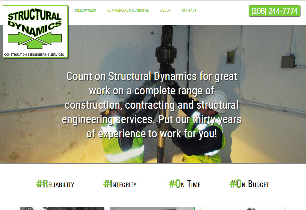
This is a great marketing lesson. A typical vertical market where the competition all have outdated web sites cluttered by too much needless information that most clients have no interest in. By creating a site with a contemporary look and just the information that potential clients need, they were able to boost their presence almost immediately.
Structural Dynamics
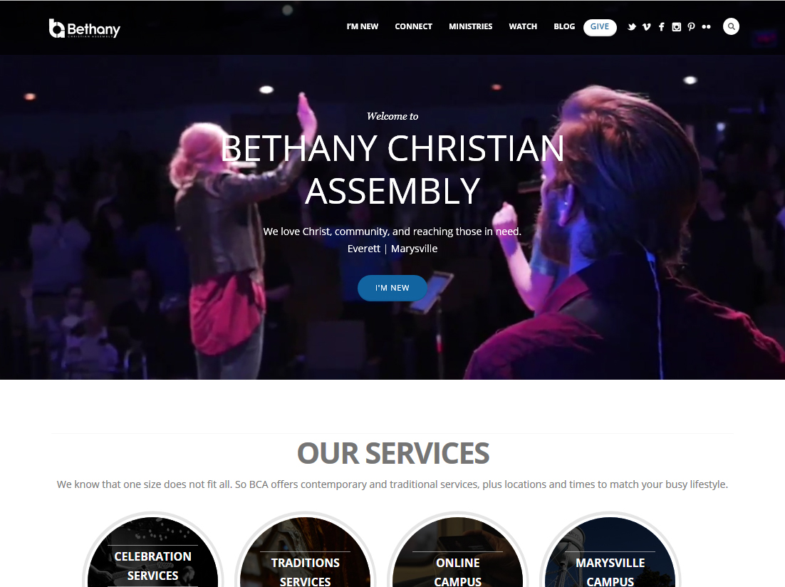
The client wanted a clean, simple site that meshes with their church philosophy. However, they also have numerous programs and events that need great Search and SEO functions to make sure their message is convenient for all their members.
Bethany Christian Assembly
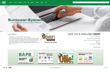
This site is unique. The content is a mix of Wordpress and PhpBB running on top of SQL Server. The content and all the stylesheets are generated from the company's separate CRM database. Registered Customers get customized content linked to the their data from a parent Windows Server accounting application.
Suntower Systems
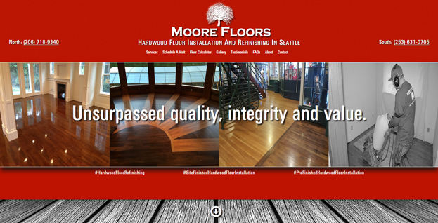
The client wanted a site that would stand out from his competitors, which tend to be boring and old-fashioned.
Moore Floors
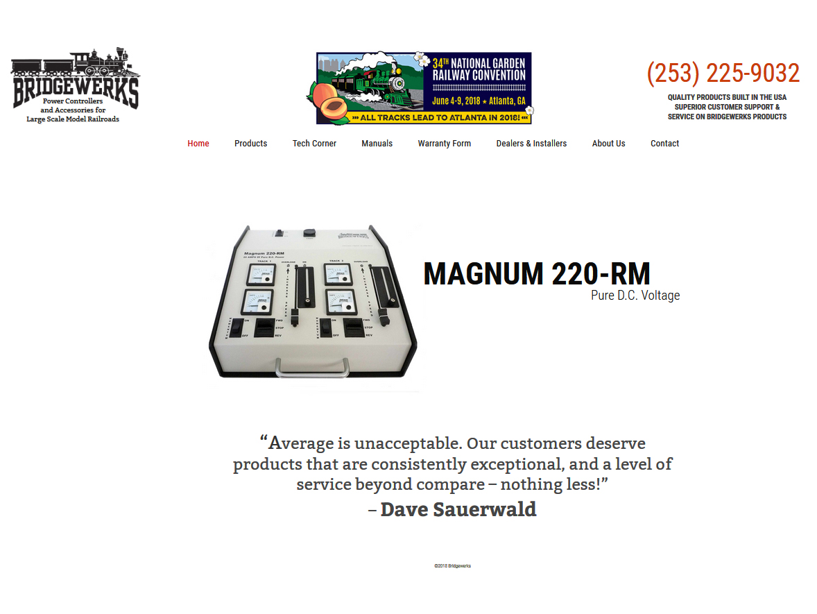
This is a very common scenario. The client originally contacted me to correct some issues with their existing site (in this case slow execution). The ultimate solution turned out to be as simple as this: just remove the unnecessary clutter.
Bridgewerks
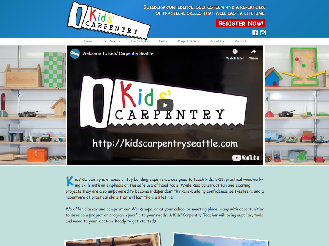
A simple e-commerce site for this service business. We wanted to make it fun and simple for parents to register their kids.
Kids Carpentry Seattle
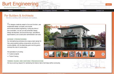
This is an otherwise fairly simple Wordpress site, but with several Flash videos and animations describing the various services in layman's terms.
Burt Engineering
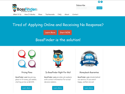
An e-commerce site for job seekers. The design was based on the 'BossFinder Man' cartoon character. The idea was to make searching for a job more fun and less intimidating.
BossFinder
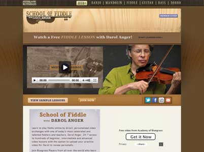
One of my best layouts using straight CSS and very little scripting. The design has some nice work in Illustrator. Somewhat sadly, the site has since been converted to Wordpress. I say 'sadly' because although I love Wordpress, the reason a lot of Wordpress conversions don't look that great is because Wordpress wasn't part of the original plan. The moral is: don't try to fit a square peg into a round hole.
Academy Of Bluegrass
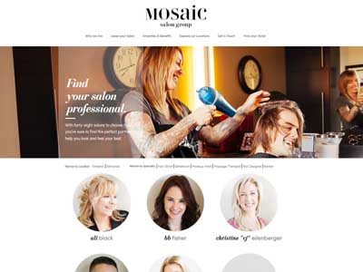
This site combines identity and branding with a client scheduling app which enables customers and salon owners to manage their own appointments.
Mosaic Salon Group
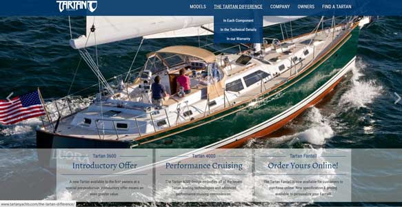
A high ticket item site that just needs to be beautiful, clear and direct. After all, the boats sell themselves, right?
Tartan Yachts
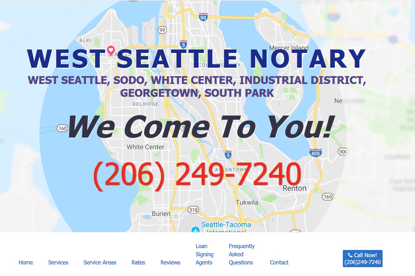
I like this site because it's simple and it sells. On one page we place all the key pieces of information and key words that visitors and search engines are going to want to see. All we need to do is lay it out in a straightforward manner and we're done. No tricks. Just common sense marketing.
West Seattle Notary
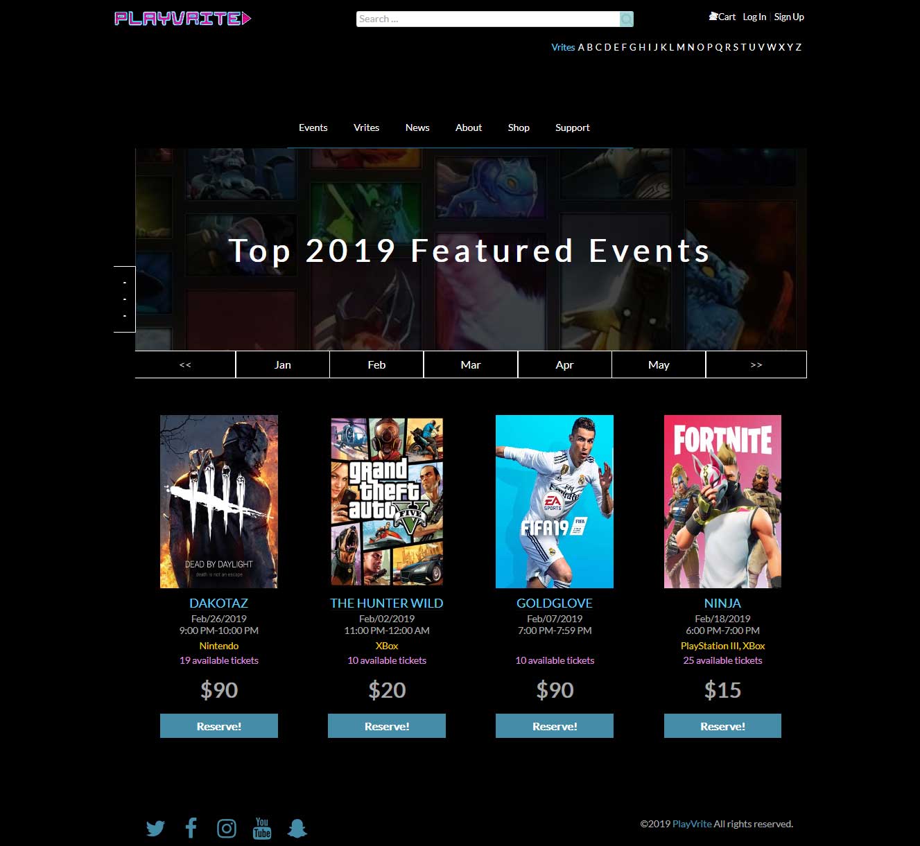
This has been a fun project that is really something new: a site for gamers to play with the stars in the gamer world. We adapted a standard ticketing application to meet the unique needs of gamers.
PlayVrite

This is a highly customized e-commerce Drupal site for a medical products manufacturer. Their products feature extremely detailed product descriptions and very complex discounts. The challenge was to create a site that helped customers get to the information they need as quickly as possible.
Simulab
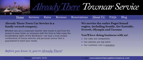
A very simple business card site formatted specifically to be easy for mobile users. It's often more challenging making something good on a small budget.
Already There Towncar
The client sells performance enhancements for trucks. So we wanted the branding to be powerful, exciting and big!
Heath Diesel Power
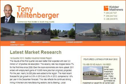
The client wanted to attract prospects searching for commercial property. We developed a system to import listings into a large table with sophisticated Javascript-based search. This made for better SEO than any of the competitors which bring in their listings from aggregators—which has no SEO value.
Tony Miltenberger
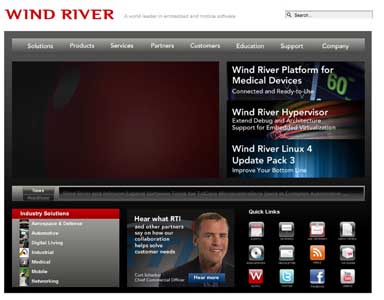
As a leader in software for embedded devices, the client needed a site that not only highlighted their company's worldwide presence, but also would provide easy access to sales information, documentation and support tools for their wide range of products and services.
Wind River
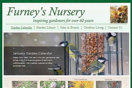
Furney's has been a fixture in the community for many years. They wanted a fresh makeover that would make long-time customers give them a second look while maintaining their friendly, local image.
Furney’s Nursery
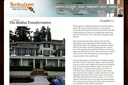
This is a fairly common task. Tenhulzen already had a site, but it had been completely hard coded. I added a self-service framework; keeping the existing overall 'look' but allowing them to update with their own beautiful case studies.
Tenhulzen Painting
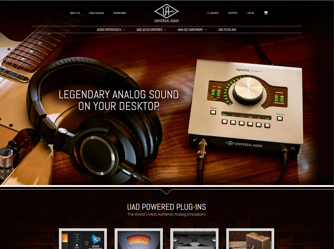
UA is a manufacturer of boutique gear used by audio professionals around the world. The challenge here was to create a modern look, while maintaining a link to their classic past. Also, the site needs to be a trove for all manner of technical documents. These need to be easy to find so lots of time was spent on making Search as easy as possible.
Universal Audio
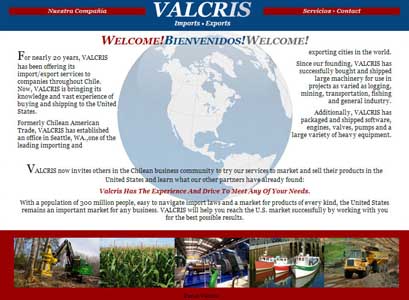
A simple business card site with a twist. The site automatically detects the user's country and delivers either English or Spanish versions of each page. Translation can get pricey, but for a few pages it's a nice touch.
Valcris
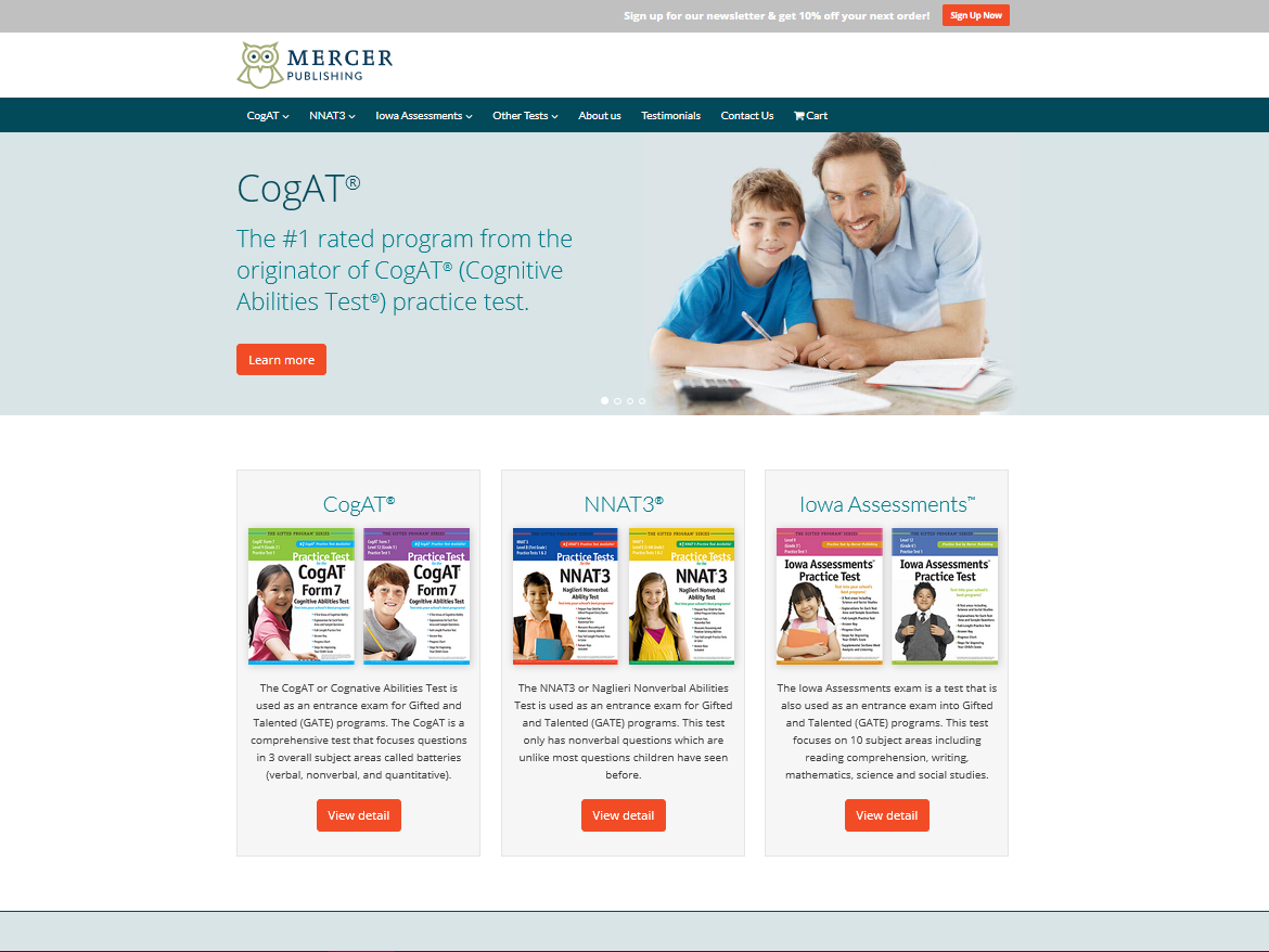
The client originally contacted me for SEO work. He was the originator in the market and had the best product, but was getting beaten byt a competitor who had created a much better web site and videos. We updated the web site and created a video that showed them to be the quality leader.
Mercer Publishing

The client wanted a site that would stand out from his competitors, which tend to be boring and old-fashioned.
LaPalma Medical Staffing

A one-page business card with a simple gallery. The client provides high-end services so the idea here was simple, bold elegance.
Andrews & Andrews
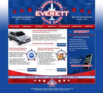
There is a lot of artwork on this site! The client is in a very competitive business and provides lots of value-added services for his customers. So we wanted to make sure that the site stands out from the crowd.
Econolube Autocare
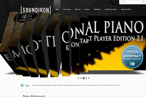
This is one of the most complex Wordpress sites you're likely to run across. What I like best is that it doesn't look like a Wordpress site. The slidey dicey front piece is one of a series of Flash animations I did for the marquee products.
SoundIron
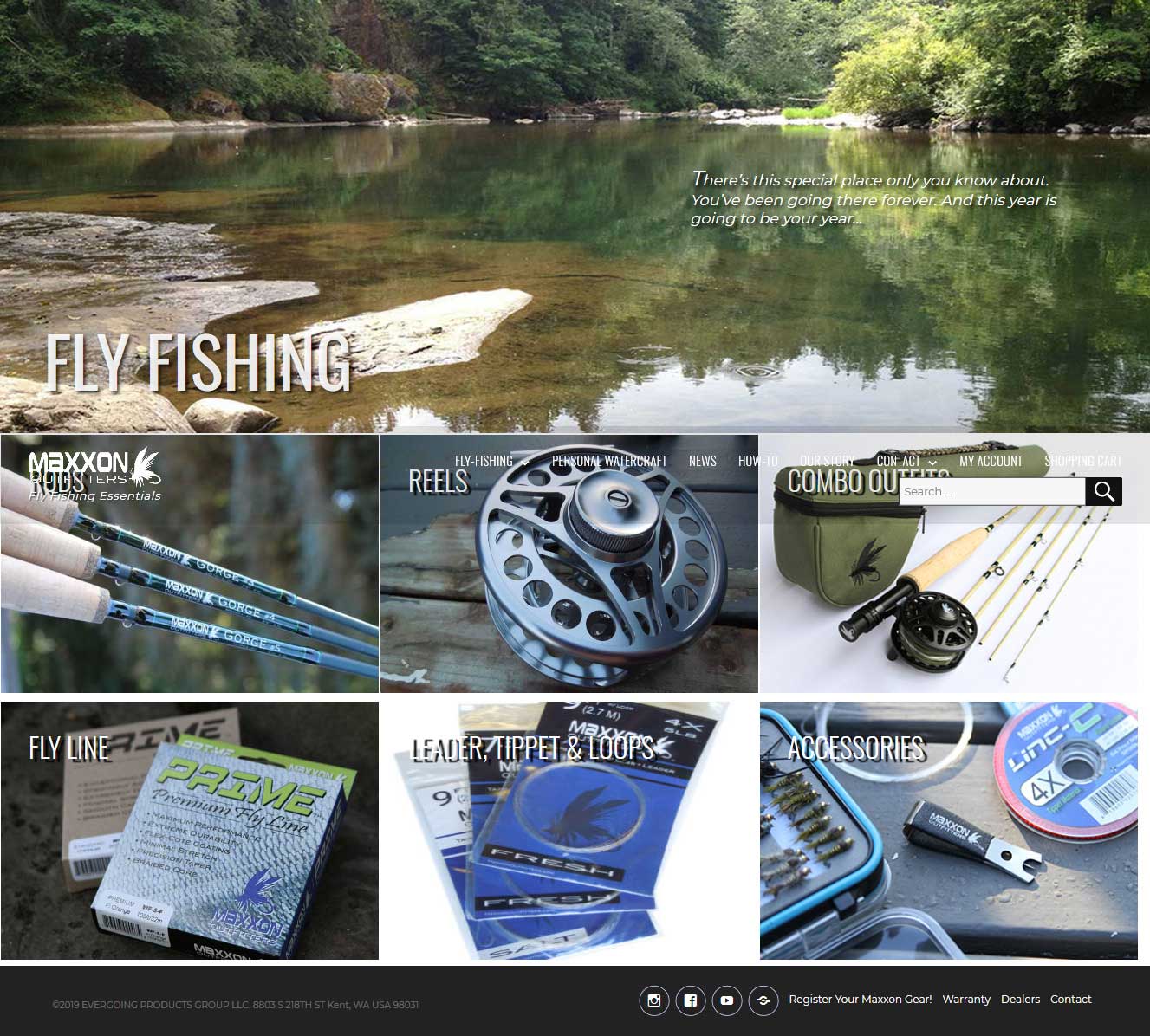
The client need a budget site that could compete with several established brands. The solution was in using great photography which makes an instant impression.
MaxxonOutfitters

Replacing an older Flash based site with a modern SEO friendly site. Replicating the visual effects is easy with a bit of jQuery and CSS.
HHJ Construction
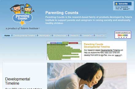
The client wanted branding that was simple, playful and soft. They also wanted their site be easy to add new information to on a regular basis so we spent a good deal of time on the back end. A lot of sites are supposed to be 'user-updateable' but for it to really work, that really is something that needs to be pre-planned. If it's not easy to use, it doesn't happen!
Parenting Counts
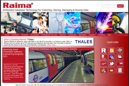
Raima is a world leader in databases for devices from phones to railroads and yet their brand recognition was low. We put together a new branding and site that not only provide product information, but highlight all the exciting products and industries they work in.
Raima
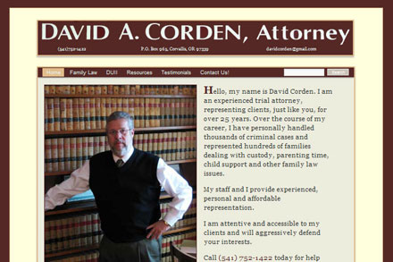
The client wanted a site that would be approachable and provide easy to understand information about both his services and the various legal issues. We spent a lot of time on the Search function, making sure users could search in plain English for information about some pretty technical legal terms.
David A. Corden
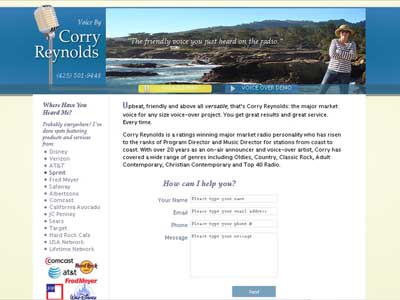
Many people don't realize that less can be much more. A powerful one page site often will rank higher and make a greater impact than tons of 'stuff'.
Corry Reynolds
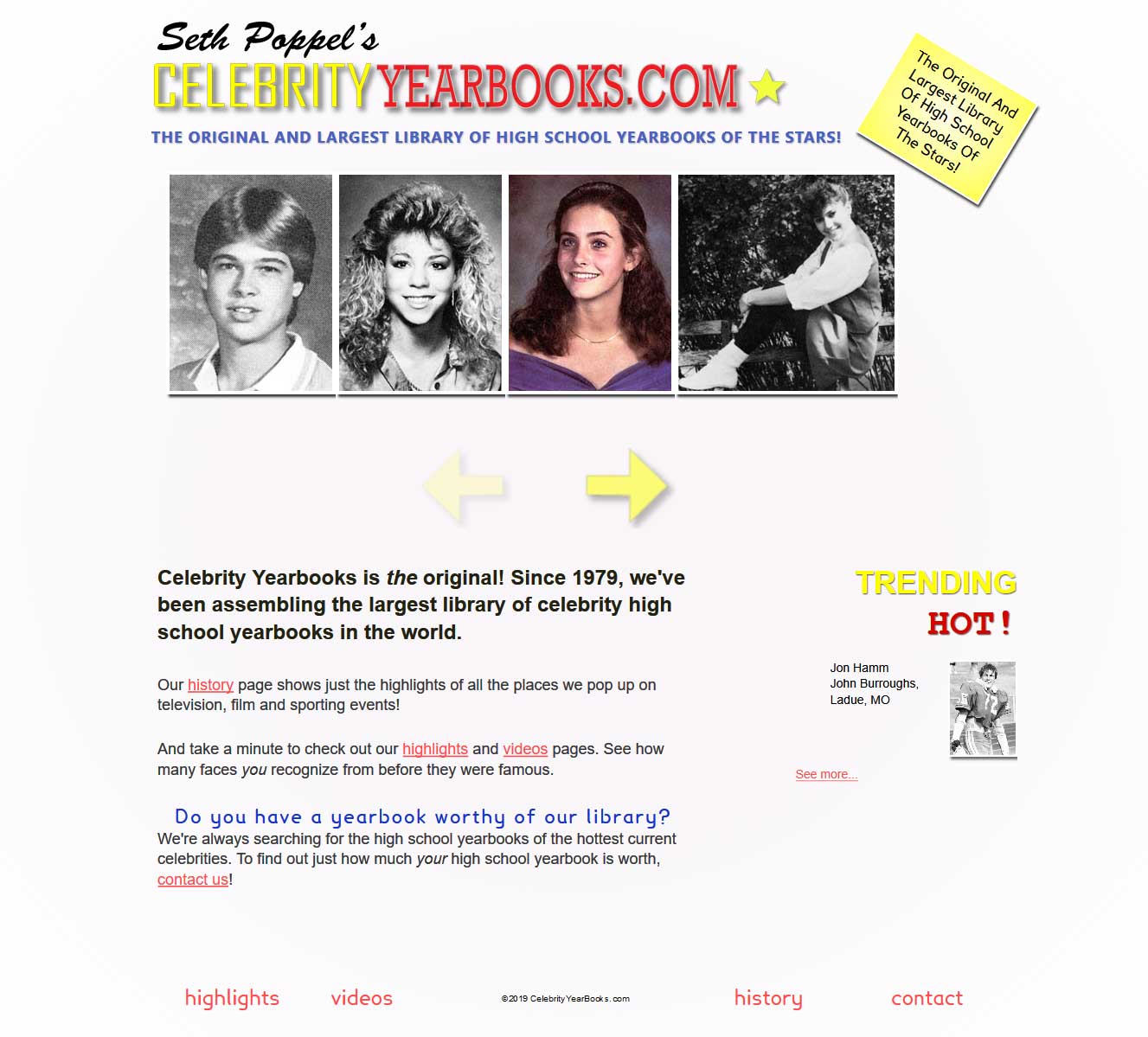
You've seen Seth's high school yearbook pictures everywhere. Unfortunately, they are almost always buried in someone else's brand. The challenge here was to let his amazing library shine on it's own.
Seth Poppel’s Celebrity Yearbooks
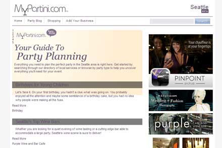
A custom site which aggregates fun information from around the web for party planners and people who just love going to parties!
MyPartini
Blog
I blog a good deal about web design, SEO and marketing and I think you will find it helpful. Here are some recent posts:
Write More Like You Talk
Are you kidding me?
You Need A Video
Why should I care that you document your work properly?
What is your logo message?
Want to know even more? Check out the entire blog or specific posts on:
Quote
It's simple. You need a web site that works. Branding people remember. Copy that gets results. So... let's go!