Marketing, design and web development in Seattle
- PO Box 13094 Seattle, WA 98198
- mail@jchwebdev.com
- (206) 949-0892
Blog
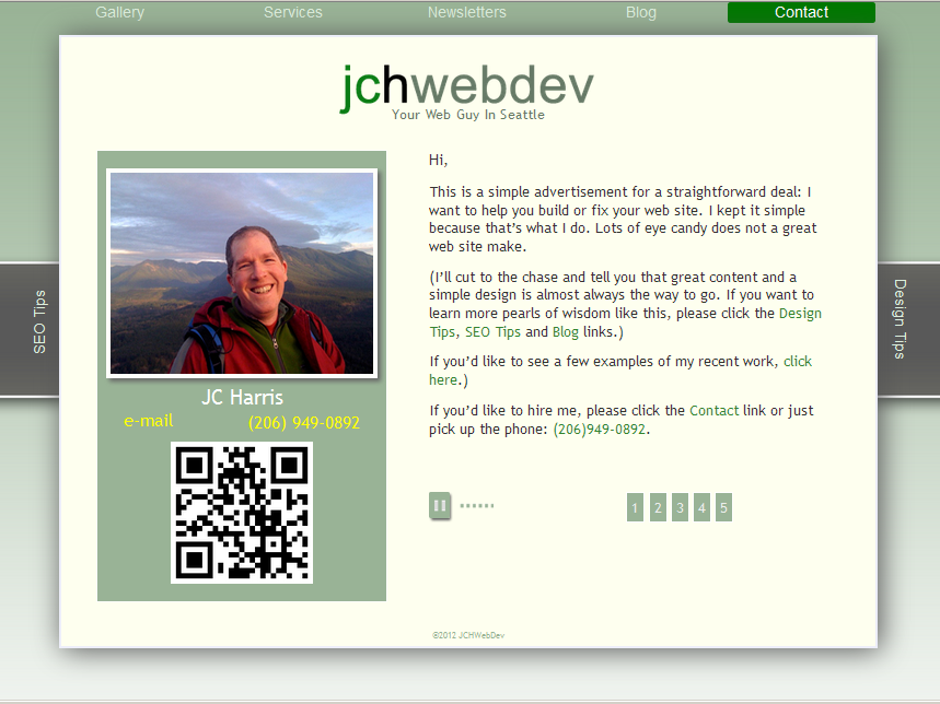
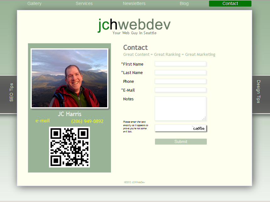
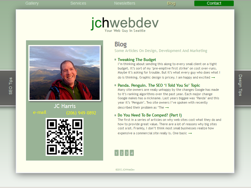
Before. After.
Before. After.
I recently re-did the site theme, which I mentioned in the September 2013 newsletter.
Here are the ‘befores’ of the home, contact and blog pages so you can see what I was talking about.
As I said in the article, “if I don’t keep my site fresh, how can I recommend that you do the same?”
My site was a good candidate for re-theming—a fresh coat of paint—rather than a complete re-build. I didn’t need to do all new content. I just wanted it to look more contemporary.
There are two current trends in design that you should consider: simplicity and flatness. A large part of this is due to mobile apps. More and more sites want to look like a mobile app. And more and more sites want to be able to be easily re-purposed as mobile apps. A simple, flatter design is easier to re-purpose. It looks better on a variety of screen sizes.
You can get a good idea of ‘flatness’ by looking at most major sites. Facebook is flat. Windows 8 is flat. The new Apple IOS7 is flat. My goal was to have a theme that looked ‘flatter’ but would look almost identical on a mobile phone. I think it’s pretty close.
Fairly Painless
Creating this theme was about ten hours of work. So you can do a lot to freshen your site in a short time. But as I also said in the article, “this also shows what a theme cannot do.” I was able to do this fairly easily because I practice what I preach: I structure my content in such a way that when it comes time to ‘paint the house’ it’s easy to do.
← Know What You Want The Site To DoFour Types Of Web Sites →
Quote
It's simple. You need a web site that works. Branding people remember. Copy that gets results. So... let's go!


Leave a Comment